A new way to edit your app settings
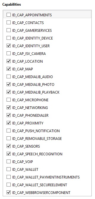
As part of the recent changes to the Windows Phone SDK, Microsoft has kindly added a user interface for editing your app’s manifest file.
Back in Windows Phone 7/Visual Studio 2010 days, when you wanted to define the capabilities your app required, or make other configuration changes, you had to edit the XML directly in the WMAppManifest file.
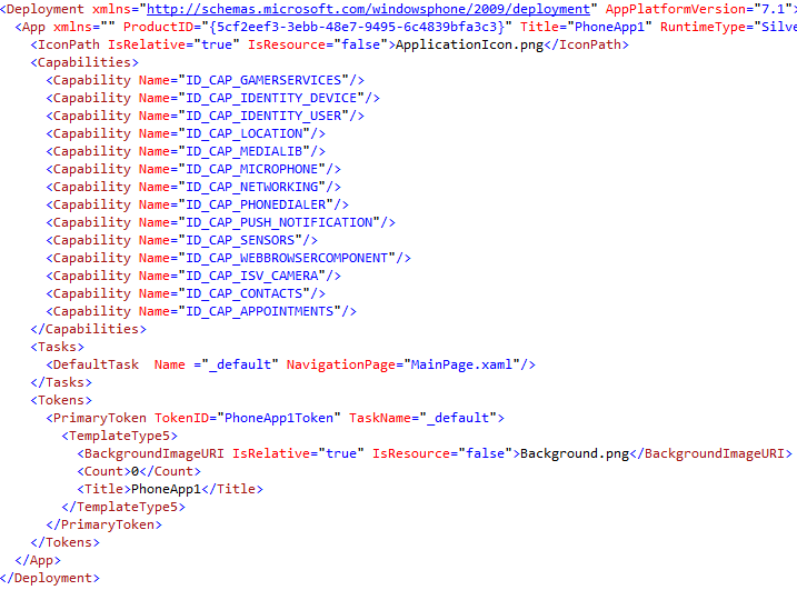
The Windows Phone 8 SDK now includes a nice little manifest designer, which is not only a nice touch, but pretty much required now that there is a raft of new properties that you can set.
Double clicking the WMAppMenifest file in your Visual Studio project will automatically open the manifest designer, instead of the XML source. The various settings in the manifest are available from one of the tabbed sections of the manifest designer.
Windows Phone 8 – First Look at the SDK
So like many Windows developers I have been waiting (not so patiently) for the release of the Windows Phone 8 SDK. Like many, I questioned Microsoft's delay at releasing the SDK to the developer community and wondered why it had taken them so long.
Having downloaded the SDK after its Tuesday release and thrown together a quick sample project, I can honestly say that I am impressed. What has impressed me the most is the quality of the emulator. The Windows Phone 7 emulator helped you develop apps by providing the hooks to many of the built in features, such as contacts and the camera, but these were only available when you called specific methods of the API. For instance, you only had access to the contacts list when you called one of the chooser tasks, such as the email address chooser task. In the Windows Phone 8 SDK all this has changed. The emulator provides what can only be described as the complete phone OS in a virtual machine.
As I fired up my first WP8 app (using one of the ready-to-run templates) I was more interesting in hitting the Windows key on the emulator and exploring the WP8 interface than I was on getting down-and-dirty with the XAML or c# code. To say that I was impressed is an understatement. As I said to a colleague, if I could pick up my laptop and start making calls I'd be running this baby everywhere.
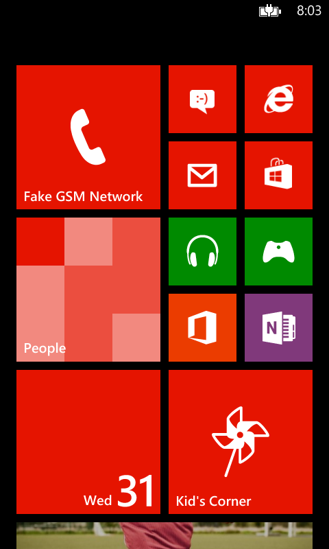
Start Screen
The most obvious change between WP7 and WP8 is the start screen. Gone is the "waste of space" (as one buddy called it) at the right hand side and in its place is a full-screen of customizable live-tiles that enable you to make YOUR Windows Phone truly yours. No longer are you stuck with the grid of 62x62 pixel tiles. You can now choose from three sizes depending on the importance you place on the application the tile refers to. Spend all your time texting your friends, then you'll want the Messaging tile huge.
Kid's Corner
As the father of a 4-year old, I can't tell you how excited I was when I first read about the Kid's Corner feature on Windows Phone 8. Comments from popular blogs and IT news sites tended to be split into two camps. Those who thought having a save place for your kids to play was great and those who thought you were stupid for giving your expensive smart phone to a child. Obviously the latter seldom spend any time with children.
I love the idea of being able to let my son play games while we face those unavoidable delays, such as doctor's surgery rooms or the hairdresser. The fact that he can play and I don't have to worry about him pressing the wrong combination of buttons and making a long-distance means I can relax and not be a helicopter parent.
So how does Kid's Corner Work?
Pressing the Kid's Corner tile on the start screen will enable you to configure the apps, games and music you want your children to have access to. The configuration tool will also prompt you to set a password for the lock screen, so that if your kids turn out to be ultra-smart (as most do) and figure out the different swipe gesture required to enter with 'full-permissions', you'll be safe.
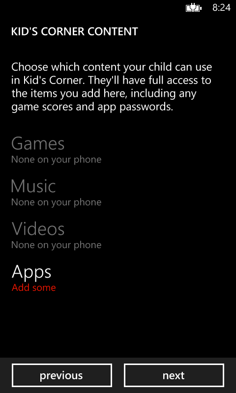
Once configured, Kid's Corner can be access by swiping left on the lock screen. Once the little-ones have played all the games you want, you can exit Kid's Corner by pressing power button. Once you're back to the familiar lock screen, enter your password to unlock the phone with full permissions.
Now where's a REAL device?
After about 10-minute I was staring at my newly un-remarkable WP7 Nokia 800 and wondering how I could get me hands on a Windows Phone 8 device. Sadly the news is not good. After all the waiting, anticipation and even more waiting, I still won't be able to get a device from my carrier (or any other carrier in Australia) for quite a while yet. My phone is out of contract and I am ready to buy, but neither love nor money will have me showing off a WP8 device any time soon to my Android totting colleagues. Damn, that Samsung ATIV S looks really great – shame it's exclusive to Optus (who chose to forget my neck-of-the-woods when building towers).
Resizing the HubTile Control
One common task is to make the HubTile larger, to provide better proportions on a single page. The original HubTile is modelled after the live tiles on the Windows Phone 7 start screen, so it was set at a size of 173x173. This works fine on the start screen, but on a single page inside your app it will feel a little awkward with the blank space on the right hand side.
In Blend, right click on the AvatarListView in the Objects and Timeline panel. Edit Additional Template - Edit Generated Items (ItemTemplate) - Edit a Copy. Give your template a name (AvatarItemTemplate) and accept the default to define it in the current document.
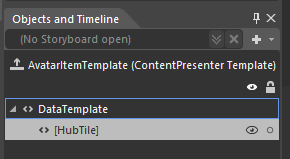
Next, right click on the HubTile element in the Objects and Timeline panel and choose Edit Template - Edit a copy and name it AvatarHubTileStyle.
This will create a new control template based on the original HubTile. Your AvatarHubTileStyle will contain a number of elements as shown in the picture below.
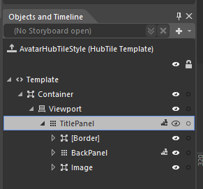
If you click on the TitlePanel element, you see that the magic of the HubTile is really just made up of three different elements a Border, BackPanel (a Grid) and an Image (inside a Border). Animations are used to move and flip these elements to give them the "Live Tile" feel.
Now that you have your own version of the HubTile to play with, you are only limited by your imagination as to how you want it to be rendered.
DataBinding HubTiles
In an earlier post I looked at adding data binding to a single HubTile control. In this post I'm going to take that to the next logical step and show you how to use data binding to create a dynamic set of HubTiles.
Like every Windows Phone control, it is possible to bind the properties of the HubTile control to values in a DataSource, such as a List or ObservableCollection. These DataSources could be located in the ViewModel portion of your app if you are using the MVVM pattern, but for this example we’ll bind our HubTiles to a local List.
We'll reuse the HubTileItem class we built in the earlier post, but instead of creating just one item, we'll be building and data binding to a List<HubTileItem> object. The easy way to do this is to declare a local List and then call a method that populates this List with values when the page loads.
Firstly, create a property named HubTiles, which will be of type List<HubTileItem>. This will hold our HubTileItems and will be used to data bind to the ListView.
private List<HubTileItem> hubTiles;
public List<HubTileItem> HubTiles
{
    get { return hubTiles; }
}
Next, create a method to add some items into our List of HubTileItems and call this method in the page constructor.
// Constructor
public MainPage()
{
    InitializeComponent();

    PopulateHubTiles();
}

private void PopulateHubTiles()
{
    hubTiles = new List<HubTileItem>();

    hubTiles.Add(
        new HubTileItem
        {
            Title = "Sam",
            Message = "Yosemite Sam",
            ImageUri = new Uri("/Assets/Images/Yosemite-Sam.jpg", UriKind.Relative)
        });

 ...
    hubTiles.Add(
        new HubTileItem
        {
            Title = "Wiley",
            Message = "Wiley Coyote",
            ImageUri = new Uri("/Assets/Images/Wiley-Coyote.jpg", UriKind.Relative)
        });
}
In XAML, create a new ListBox and add our data-bound HubTile to its ItemTemplate.
<ListBox Grid.Row="0" Name="AvatarListView">
    <ListBox.ItemTemplate>
        <DataTemplate>
            <toolkit:HubTile Margin="12,12,0,0" x:Name="MyHubTile"
                        Title="{Binding Title}"
                        Message="{Binding Message}"
                        Source="{Binding ImageUri}">
            </toolkit:HubTile>
        </DataTemplate>
    </ListBox.ItemTemplate>
</ListBox>
Once again we'll override the OnNavigatedTo event and add the code to assign our List property as the ItemsSource for the ListView.
protected override void OnNavigatedTo(NavigationEventArgs e)
{
    AvatarListView.ItemsSource = HubTiles;
    base.OnNavigatedTo(e);
}
Run the app and you should see a nice list of HubTiles running down the page.
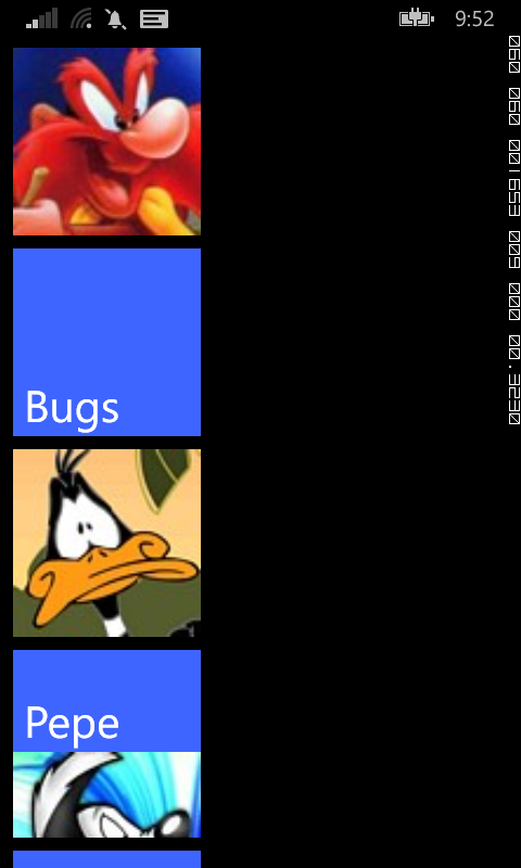
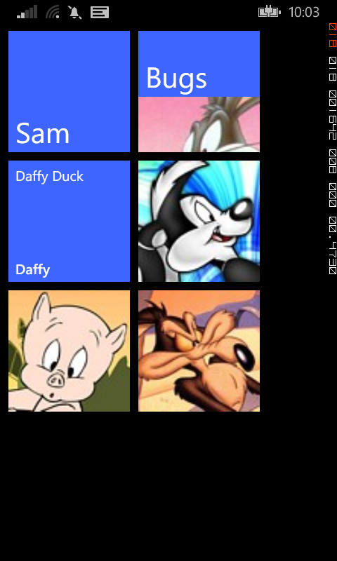
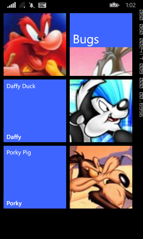
The long list of HubTiles is probably not what you were expecting, but thankfully the Windows Phone Toolkit provides another control, called the WrapPanel that we can use to layout our tiles in a more visually appealing manner.
The WrapPanel is much like a StackPanel, but lays out items in both directions, that is Top-Bottom and Left-Right.
To utilise the WrapPanel in our ListView, all we need to do is add it as the ItemsPaneltemplate and set the orientation to Horizontal. The WrapPanel with then lay out the HubTiles Left-Right, then downwards.
<ListBox Grid.Row="0" Name="AvatarListView">
    <ListBox.ItemsPanel>
        <ItemsPanelTemplate>
            <toolkit:WrapPanel Orientation="Horizontal" />
        </ItemsPanelTemplate>
    </ListBox.ItemsPanel>
    <ListBox.ItemTemplate>
        <DataTemplate>
            <toolkit:HubTile Margin="12,12,0,0" x:Name="MyHubTile"
                        Title="{Binding Title}"
                        Message="{Binding Message}"
                        Source="{Binding ImageUri}">
            </toolkit:HubTile>
        </DataTemplate>
    </ListBox.ItemTemplate>
</ListBox>
The result will be a nice little grid of HubTiles that will no-doubt make your app the talk of the town.
DataBinding a single HubTile
A little while ago I did a series of posts showing you how to build a Metro-styled start page for our app using HubTile controls from the Windows Phone Toolkit. In those examples, we built up the structure of the page in XAML alone. This approach may be fine for a static list of items, such as a page used for navigating to other pages in your app, but it becomes problematic when we want to display dynamic data, such as values created by the user.
To add data binding to the single HubTile control we created in this earlier post, we need to make a few changes to the XAML and C# code-behind. The first step is to create a new class representing the object we want to bind to the HubTile. In this example we'll just create a simple object HubTileItem with the required properties, but this could be any relevant business object you want to display.
public class HubTileItem
{
    public string Title { get; set; }
    public string Message { get; set; }
    public Uri ImageUri { get; set; }

}
If you're familiar with XAML DataBinding in general, the changes to our HubTile control will be pretty straightforward. Basically we want to replace the hardcoded values for Title, Message and Source with their appropriate properties from their DataSource. We'll also give our HubTile a name, so that we can refer to it from our C# code-behind.
<toolkit:HubTile Margin="12,12,0,0" x:Name="MyHubTile"
            Title="{Binding Title}"
            Message="{Binding Message}"
            Source="{Binding ImageUri}">
</toolkit:HubTile>
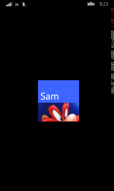
The last step is to create a new object of type HubTileItem and assign it as the DataContext for the HubTile control. To do this, we'll override the OnNavigatedTo event and include the code to create and assign the HubTileItem.
protected override void OnNavigatedTo(NavigationEventArgs e)
{
    HubTileItem item = new HubTileItem
    {
        Title = "Sam",
        Message = "Yosemite Sam",
        ImageUri = new Uri("/Assets/Images/Yosemite-Sam.jpg", UriKind.Relative)
    };

    MyHubTile.DataContext = item;

    base.OnNavigatedTo(e);
}
Run your app and your newly data bound HubTile should display exactly the same as it did before.
New size options for HubTiles
One of the main visual changes to the start screen in Windows Phone 7.8 and 8 is that it now supports three sizes of live tiles. The default (medium) tile is now larger and gone is the black strip to the right that used to be home to an arrow that took you to the app screen.
This milestone seemed like a good time to revisit the HubTile control from the Windows Phone Toolkit to see if it could support these new formats. The early versions on the HubTile is was a painful process to choose the size of the tile, having to resort to copying and modifying the XAML elements and animations, as discussed in the post.
Thankfully, since the September 2012 release of the Windows Phone Toolkit, the HubTile control now comes with a Size property that allows you to select from four sizes, Default, Small, Medium and Large. A look at the source code for this release reveals the size of each of these tiles.
switch (hubTile.Size)
{
    case TileSize.Default:
        hubTile.Width = 173;
        hubTile.Height = 173;
        break;

    case TileSize.Small:
        hubTile.Width = 99;
        hubTile.Height = 99;
        break;

    case TileSize.Medium:
        hubTile.Width = 210;
        hubTile.Height = 210;
        break;

    case TileSize.Large:
        hubTile.Width = 432;
        hubTile.Height = 210;
        break;
}
Using these new sizes with the data bound HubTile example we used in another post is simple. The easiest option is to specify the Size property in the ItemTemplate.
<ListBox Grid.Row="0" Name="AvatarListView">
    <ListBox.ItemsPanel>
        <ItemsPanelTemplate>
            <toolkit:WrapPanel Orientation="Horizontal" />
        </ItemsPanelTemplate>
    </ListBox.ItemsPanel>
    <ListBox.ItemTemplate>
        <DataTemplate>
            <toolkit:HubTile
		Margin="12,12,0,0"
		Title="{Binding Title}"
		Message="{Binding Message}"
		Source="{Binding ImageUri}"
                Size="Medium"/>
        </DataTemplate>
    </ListBox.ItemTemplate>
</ListBox>
Of course, you can also bind the Size property to property on your underlying data source. To do this, add a TileSize property to the HubTileItem class and modify the HubTile control XAML as below.
public class HubTileItem
{
    public string Title { get; set; }
    public string Message { get; set; }
    public Uri ImageUri { get; set; }
    public TileSize TileSize {get; set;}
}
<toolkit:HubTile
	Margin="12,12,0,0"
	Title="{Binding Title}"
	Message="{Binding Message}"
	Source="{Binding ImageUri}"
   	Size="{Binding TileSize}"/>
Using the Bing Maps API in your WP7 App
A while ago I wrote a post detailing how easy it was to use the Bing Maps API to GeoCode an address, which enables you to get the geographical position (Latitude and Longitude) of a location when only given the street address.
This has been invaluable in a number of applications since then including the TrafficMATE app which used street addresses to help create Routes to check for traffic incidents. So how exactly can we get the Lat/Long for a location when only given the street address? Well thankfully it's easy.
As in the previous post, we need to start by adding a Service Reference to our project. The Bing Maps API service that deals with Geocoding is located at http://dev.virtualearth.net/webservices/v1/geocodeservice/geocodeservice.svc
I called the reference Bing.Geocode, but feel free to call it whatever you like.
You will also need to get a developer key to use with the API, but don't worry that's easy too. Chances are that if you have already been using Bing Maps with the Map control in Windows Phone 7 then you already have one of these. If not, go get one at http://www.bingmapsportal.com/
The code that calls the Bing Maps Geocode service is fairly easy. In your XAML all you really need is a TextBox where the user can enter an address and then a Button they click to call the function.
//get lat/long for this address
GeocodeRequest request = new GeocodeRequest();
request.Credentials = new Credentials();
request.Credentials.ApplicationId = YourKey;
request.Query = this.TextBoxOrigin.Text;
GeocodeServiceClient client = new GeocodeServiceClient();
client.GeocodeCompleted += new EventHandler<GeocodeCompletedEventArgs>(client_GeocodeCompleted);
client.GeocodeAsync(request);
Then all you need to do is interrogate the results sent back from Bing in your GeocodeCompleted event handler.
void client_GeocodeCompleted(object sender, GeocodeCompletedEventArgs e)
{
GeocodeResponse response = e.Result;
if (response.Results.Count > 0)
{
MessageBox.Show(response.Results[0].Address.FormattedAddress);
}
}
As you can see from the code above, I am simply selecting the first record in the Results array and displaying the Address.FormattedAddress property. Other properties that may be useful are Address.Locality (AKA:Suburb) Address.AdminDistrict (AKA:State).
The other important fields that you will want to process are the Lat and Long. These are contained within the Location array in fields aptly named Latitude and Longitude. These could be easily returned using the syntax response.Results[0]Location[0]Latitude and response.Results[0]Location[0]Longitude.
Handling Pushpins selection with the WP7 Map control
As mentioned in the previous post, one of the benefits of using your own custom business objects as the data source for your Map control Pushpin layer is that you can access all the information about the item you select.
So how do we get back a single Camera object when a user presses on a pushpin? Well thankfully this is very easy. By using a List<Camera> as the ItemSource for the MapsItemControl control containing our Pushpins we are able to extract the data back when the user presses the Pushpin.
There are a number of methods you can use that are triggered when the user clicks or taps on the screen, but in this example we will use the new ‘Tap’ event, made available in the Mango release. The map xaml has been covered in the previous post, but now all we need to do is add the Tap event handler such as:
<my:Pushpin Location="{Binding Location}" Tap="Pushpin_Tap" >
</my:Pushpin>
The key to unlocking all the goodness obtained by binding the pushpins to your own objects is to realise that the DataContext of the Pushpin actually contains your business object.
private void Pushpin_Tap(object sender, System.Windows.Input.GestureEventArgs e)
{
var pushpin = sender as Pushpin;
Camera cam= (Camera)pushpin.DataContext;
MessageBox.Show(cam.Name);
}
In this example we can direct cast the Pushpin.DataContext to our business object, which in this example is called Camera. Once we have a Camera object, we can access any of the properties and methods associated with it.
Obviously you could do a lot more than simply displaying a message when the Pushpin is selected, for example you could navigate to another page displaying information relevant to the selected Pushpin.
Using Business Objects with the WP7 Map Control
One aspect of creating and adding pushpins to the Windows Phone 7 Map control that turned out to be a welcome revelation to me is that most geo-centric Business Objects can be used as the data source for the pushpin layer with little or no modification.
In a previous post we looked at how easy it was to add a single pushpin to the Map control. If we look at that method again, we see that all we really need is a geographical location. This means that as long as your object has a Latitude and Longitude, you can use it as a pushpin.
This was very handy in TrafficMATE especially when displaying camera locations on a map. The Camera object model we created already contained the Lat/Long of the camera. This meant that I could easily use a List<Camera> object as the ItemSource for the pushpin layer.
Here’s the xaml for a map showing camera locations.
<my:Map x:Name="CameraMap"
CredentialsProvider="{Binding CredentialsProvider}"
CopyrightVisibility="Collapsed"
LogoVisibility="Collapsed"
ZoomLevel="16">
<my:Map.Foreground>
<SolidColorBrush Color="{StaticResource PhoneForegroundColor}"/>
</my:Map.Foreground>
<my:MapItemsControl x:Name="PushpinItems" Height="300">
<my:MapItemsControl.ItemTemplate>
<DataTemplate>
<my:Pushpin Location="{Binding Location}" >
</my:Pushpin>
</DataTemplate>
</my:MapItemsControl.ItemTemplate>
</my:MapItemsControl>
</my:Map>
The code that is of interest to us is the section defining the MapItemsContol named PushpinItems. Just like the other WP7 databindable controls, the MapItemsControl supports an ItemTemplate, which in this example is made up of Pushpin controls.
The Location property of the Pushpin, which is of type GeoCoordinate, is bound to a field in our data source called ‘Location’. All we need to support binding is ensure our business object exposes a GeoCoordinate property and we are good to go. A simplified version of the Camera object is shown below.
public class Camera
{
public string Name { get; set; }
public string Description { get; set; }
public double Latitude { get; set; }
public double Longitude { get; set; }
public GeoCoordinate Location
{
get { return new GeoCoordinate(this.Latitude, this.Longitude); }
}
}
With the help of an async call to a webservice, I populated a List<Camera> with relevant results and was able to set the ItemSource for the pushpin layer using something like:
PushpinItems.ItemsSource = cameras;
The key benefit of binding your objects directly to the pushpin layer is that you have direct access to the object whenever you select a pushpin. There is no need to make a second trip to the webservice when the user selects a pushpin - you already know everything there is to know about the underlying object. In a future post, I will explore how you can retrieve the underlying information from a Pushpin created using your business objects.
Adding a Map to your WP7 App
My recent TrafficMATE Windows Phone 7 app heavily utilised the Bing Maps control for WP7. It was used to plot route in combination with the Bing Maps Route Service API, as well as to show the location of traffic cameras.
The easiest way to get started with the Maps control for Windows Phone is to take a look at the tutorials found in the Labs provided by Microsoft. If you just want to throw up a map to display a single geographic point, then here’s how to start.
Add the control to your xaml
The Map control resides in the Microsoft.Phone.Controls.Maps library, so you will want to add a reference to this library into your project. You will also want to create a namespace reference in the XAML page where you want to use the map control.
xmlns:msmap="clr-namespace:Microsoft.Phone.Controls.Maps;assembly=Microsoft.Phone.Controls.Maps"
You can then add the map control to your xaml.
<msmap:Map x:Name="routeMap"
CredentialsProvider="{Binding CredentialsProvider}">
</msmap:Map>
Set your Bing Maps API key
To use the map you’ll need to get a key, which is free from Microsoft. Without a key, you will be stuck with the message Invalid Credentials Sign up for a developer account.
The API key is a single string, much like you may be familiar with if you have used the Google Maps API. The Map control makes it a little harder though and expects an object of the CredentialsProvider class. It’s easy enough to create a property in your .cs file that exposes a property of type CredentialsProvider and then bind that property to the map property.
private readonly CredentialsProvider _credentialsProvider = new ApplicationIdCredentialsProvider("Your Key");
public CredentialsProvider CredentialsProvider
{
get { return _credentialsProvider; }
}
Adding a pushpin to the map
The first thing you will want to do with your newly acquired map is to zoom to a certain location and display a pushpin. Thankfully there are a few ways to do this. The first is to programmatically add a pushpin to the map in your .cs file and zoom in.
The bare-bones approach to add a pushpin directly to the Map in your code is shown below.
Pushpin p = new Pushpin();
p.Location = new System.Device.Location.GeoCoordinate(51.42153, -0.20786);

//add the pushpin to the map
routeMap.Children.Add(p);
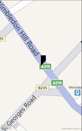
Compile and run the app and you will get a single pushpin, as shown below.
Just as you can add the pushpin in code-behind, you can also programmatically zoom the map to the chosen location, by setting the map’s Center and ZoomLevel properties. Set the zoom to an appropriate number between 1 and 19, where 19 is very close.
//set the center of the map and the zoom level
routeMap.Center = new System.Device.Location.GeoCoordinate(51.42153, -0.20786);
routeMap.ZoomLevel = 19;